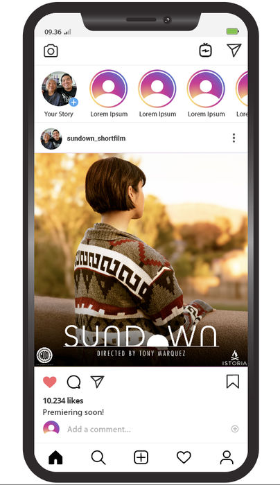
The client is working on a new film and I came along to help with branding and poster art.
I had a fairly clear image in mind when it came to the branding where I wanted the "O" of "Sundown" to look like it was setting. From there, I explored fonts to see what would fit best and when I found something close I started tweaking it a bit. I initially had no horizontal plane but I wanted to add one to give it a feel of staring at a horizon. I was happy with how it looked and then moved towards setting the whole logo behind a horizon line to make it feel like the whole logo was setting and the logo was good to go.
The client had an idea in mind for the poster, so they provided some RAW footage from their photoshoot. I chose the one I thought had the strongest composition for what I had in mind and started playing with depth and colors along with the title treatment. Check the animated gif below to see the process!


